

Airveek field guide
Food Storage Container Product Photography Guide: Build a Complete Airveek Set
Start with the supplied clear food storage container as the identity anchor, then plan three separate Airveek views: a clean empty listing image, a quiet pantry scene that gives visual scale, and a close lid-and-rim detail. Keep the transparent walls, fitted lid, and visible rim consistent, protect square and mobile crops, and use the exact lowercase morrow wordmark with its two sparkle stars only when branding is included.
Search task: How do I plan a complete product-photo set for this food storage container from one accurate source asset?
Written by LIKA
The buyer question
How do I plan a complete product-photo set for this food storage container from one accurate source asset?
Your starting product
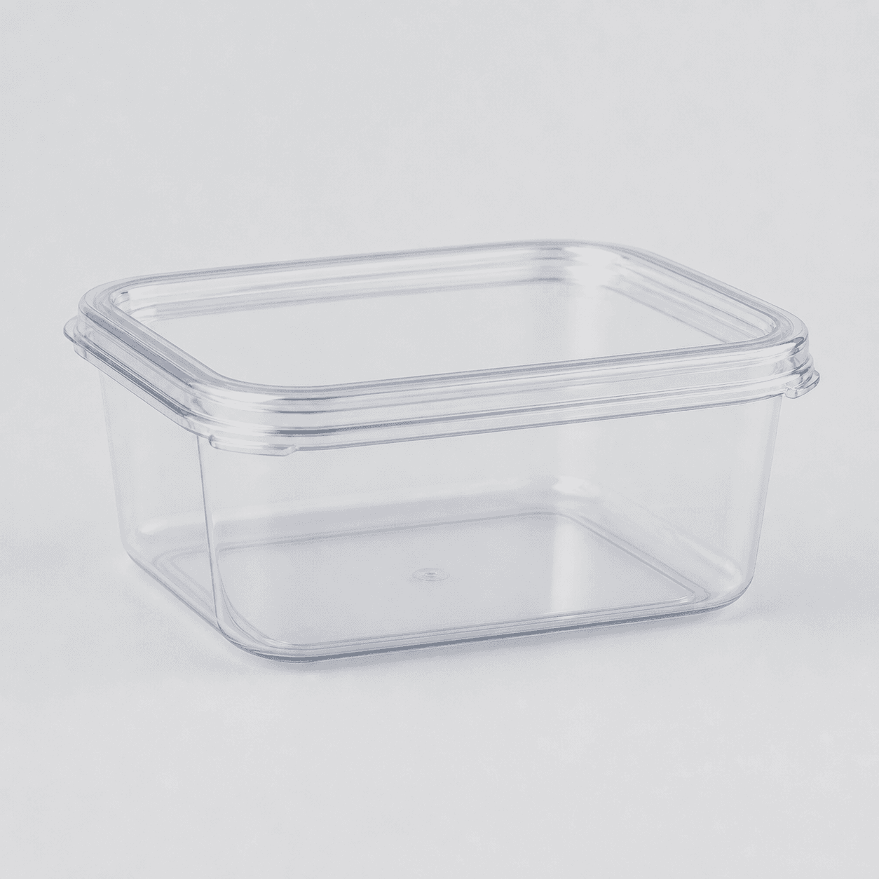
Start with a clear photo that shows the full product and the details shoppers need to see. Keep this reference nearby while you generate, compare, and refine each image.
Quick setup
- Goal
- Ecommerce product gallery and marketplace product-photo planning
- Output
- 1:1 clean listing master, 4:5 pantry lifestyle crop where supported, 1:1 lid and rim detail crop, 1500 × 1500 recommended when possible; confirm the destination's current requirements, 240 × 240 mobile-thumbnail check
- Goal
- store-listing
- Mode
- product-scene
- Scene
- studio
Example Airveek result

How to create it
1. Add the two supplied references
Upload the clear container image first and the supplied morrow logo reference second. Compare the source before each job so the empty rectangular shape, fitted transparent lid, visible rim, transparent walls, and color stay consistent. When branding is shown, preserve the exact lowercase morrow wordmark with its two sparkle stars and add no other readable brand text.
2. Turn the buyer question into a shot list
Plan three independent jobs in Airveek's product-fashion creator: the clean listing answers what the product is, the pantry view shows everyday context and a visual scale cue, and the detail view lets shoppers inspect the lid, rim, seal interface, and stacking relationship. Keep this hub distinct from the sibling pages that own each individual job.
3. Build the clean listing view
Start at /create/product-fashion with the observed product-scene, studio, and store-listing baseline. Keep one empty container and its fitted lid dominant on a light neutral background, use controlled commercial light and a natural contact shadow, and protect the complete shape for a square crop. Use the largest clean original available before destination-specific resizing.
4. Add pantry context without losing the product
Run the lifestyle prompt as its own job with the same supplied identity references. Place one open container beside its matching lid on an organized pantry counter, add only a modest dry-food cue if useful, and keep props quiet. Use soft side light with gentle fill so the transparent walls and lid edge separate from the setting. Treat the counter as context, not an exact measurement.
5. Reserve the close crop for lid and stack detail
Run the detail prompt separately and use a readable oblique angle. Keep the lid-to-rim fit, seal interface, transparent edges, and stacking contact geometry in focus. If showing a true stack needs another unit, supply a matching unit rather than asking the model to invent one. Keep food, props, badges, and other distractions out of this inspection view.
6. Review identity, mark, and crops
Compare every result beside the supplied container and logo references at full size, in the intended square or 4:5 crop, and at 240 × 240. Reject changed geometry, a hidden lid or rim, missing sparkle stars, extra readable words, duplicate products, glare that erases transparent edges, or a scene that becomes more prominent than the container.
7. Export for the destination
Keep the largest clean master and write useful alt text and a short caption that describe the visible container and the image job. Check the destination's current format, pixel, file-size, background, and automatic-cropping requirements before export; retain the listing, pantry, and detail views as a coordinated gallery rather than one overloaded collage.
Tested prompt
Use the supplied clear stackable food storage container image and the supplied fictional morrow logo reference as the only inputs. Create a coordinated three-image product-photo set for one container: a clean empty listing view for product identification, a believable pantry scene for visual scale and use, and a close view of the lid, rim, seal interface, and stacking relationship. Preserve the exact clear rectangular geometry, fitted transparent lid, visible rim, transparent walls, material appearance, and color. When branding is shown, use only the exact lowercase wordmark "morrow" with its two sparkle stars, placed naturally on the product or package; add no other readable brand text. Keep the product dominant, each view crop-safe, and the lid relationship visible. Do not invent dimensions, capacity, food-safety, microwave, freezer, airtightness, leak resistance, or other product claims; do not add extra containers, unprovided food packages, utensils, watermarks, retailer logos, or promotional overlays.Recorded settings
- Goal
- store-listing
- Mode
- product-scene
- Scene
- studio
Common problems and fixes
Problem: The transparent container blends into the background.
Fix: Use a quiet neutral surface, soft side light with gentle fill, and a natural contact shadow. Preserve tonal separation around the lid, rim, and walls instead of adding a busy background.
Problem: The pantry scene becomes more noticeable than the container.
Fix: Remove extra containers, labels, food packages, utensils, and competing products. Keep one open container and its matching lid in the foreground with lower contrast in the background.
Problem: The lid or rim disappears in the crop.
Fix: Move the lid beside the container for the lifestyle frame, pull back slightly, or use the dedicated close detail job. Retest the square-safe crop and 240 × 240 mobile view before export.
Problem: The mark drifts or extra words appear.
Fix: Re-add the supplied logo reference, preserve the exact lowercase morrow wordmark with both sparkle stars together, and remove every other readable word, floating mark, badge, or overlay.
Problem: The scene implies exact capacity, stack height, or seal performance.
Fix: Remove rulers, callouts, badges, and invented claims. Use the image for visible identity and context, and use verified product information for exact specifications.
Problem: One prompt tries to cover listing, pantry, and close detail at once.
Fix: Run three separate jobs from the same supplied source: clean empty identification, restrained pantry context, and lid/rim/detail inspection. Select the view that answers each buyer question most clearly.
What to double-check
- The supplied reference establishes one clear empty rectangular container with a fitted transparent lid, visible rim, transparent walls, and a pale neutral background. It does not establish exact dimensions, capacity, material grade, food-safety status, microwave or freezer use, airtightness, leak resistance, or other specifications.
- The available ECO19 capture contains three variations from one studio run, not independent listing, lifestyle, and detail jobs. Use its saved square result for identity and framing reference, then run the three current jobs separately.
- The available capture predates the supplied morrow logo reference and does not represent a finished branded output. Re-run with the container and logo references together before using a branded result in a gallery or campaign.
- A pantry counter or modest dry-food cue can make everyday use and visual scale easier to understand, but it cannot prove exact capacity or stack height. Verify those details separately.
- A close crop can make the lid-to-rim relationship and visible seal interface easier to inspect, but it cannot prove airtightness, leak resistance, or another performance claim.
Why this works
A clear container can disappear against a pale surface or in a busy pantry, so the set has to assign one decision to each frame. The empty listing view establishes the product, the pantry view makes everyday context and apparent scale easier to understand, and the close view enlarges the lid-to-rim and stacking relationship. Soft side light separates transparent edges, while a consistent source reference and exact supplied mark keep the three jobs coherent.
Before you export
- Use the same supplied clear container source for all three jobs and compare every result with its rectangular geometry, fitted transparent lid, visible rim, transparent walls, and color.
- Use the supplied morrow logo reference whenever branding is shown; preserve the exact lowercase wordmark and both sparkle stars together, with no other readable brand text.
- Keep the listing view empty, single-product, light, and product-dominant; preserve a square-safe master and check the product at 240 × 240.
- Use one quiet pantry counter and a modest dry-food cue for lifestyle context; keep the container and lid sharper and more prominent than the setting.
- Use a close oblique detail view for the lid-to-rim fit, visible seal interface, transparent edges, and stacking contact geometry; supply matching units if a true stack is required.
- Use soft controlled light and tonal separation so transparent edges remain readable without glare, a dark cast, or a warm shift in the visible color.
- Keep exact dimensions, capacity, stack height, food-safety, microwave or freezer use, airtightness, leak resistance, and other specifications tied to verified product information.
Common questions
What three photos should a clear food storage container product set include?
Use a clean empty listing image to establish the container and fitted lid, a restrained pantry scene to show everyday context and a visual scale cue, and a close detail image for the lid-to-rim fit, visible seal interface, and stacking relationship. Keep the same supplied container identity across all three jobs, but let each frame answer one question.
How do I show what fits inside without making an exact capacity claim?
Use a modest amount of dry food inside the open container as an everyday-use cue, keep the lid beside it, and avoid rulers, labels, measurement callouts, or overfilled styling. The pantry frame can show context and apparent scale; exact capacity and dimensions should come from verified product information.
What should the main food storage container product image show?
Show one complete container clearly enough to identify its clear rectangular shape, fitted transparent lid, visible rim, and transparent walls. Keep the product dominant on a quiet light background and protect it from automatic cropping. Google Merchant Center currently recommends around 1500 × 1500 pixels or above when possible and product occupancy between 75% and 90%; confirm the destination's current requirements before export.
How should I show the lid seal and stacking relationship?
Give the lid and rim their own close oblique view, use controlled light to separate transparent edges, and keep the product large enough to inspect on a phone. If a true stack needs a second unit, supply a matching unit instead of inventing one. A close crop can show the visible relationship, but it cannot prove airtightness, leak resistance, exact stack height, or another performance claim.
How do I keep the image copy and crop useful for search and mobile shoppers?
Place each image beside the guidance it illustrates, use short descriptive alt text such as the visible container and lid relationship, and check the intended square or 4:5 crop at full size and at 240 × 240. Describe what is actually visible rather than repeating keywords or adding claims the image cannot show.
Further reading
- Photography Workflow: How to Plan, Shoot, and Edit — Shopify
- Shopify Help Center | Taking product photographs — Shopify Help Center
- Image link [image_link] - Google Merchant Center Help — Google Merchant Center Help
- Image SEO Best Practices — Google Search Central
- Dishwasher safe canisters with easy open — Reddit r/organizing discussion
- The Complete Guide to Ecommerce Photography — Shopify
- Marketplace/category reference for stackable food storage containers — Amazon marketplace reference